Trusted by leading brands worldwide
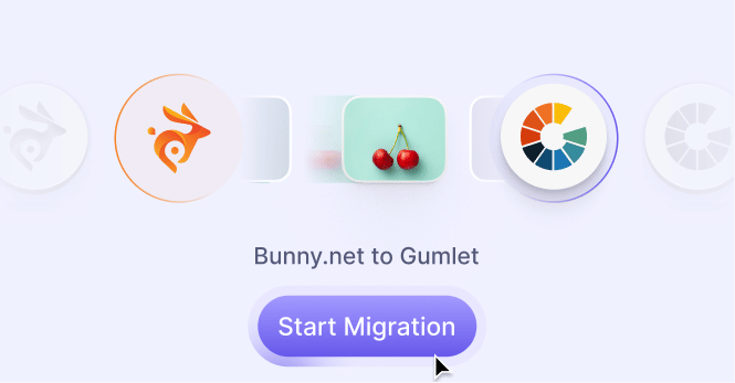
Why do users switch from Bunny Optimizer to Gumlet?
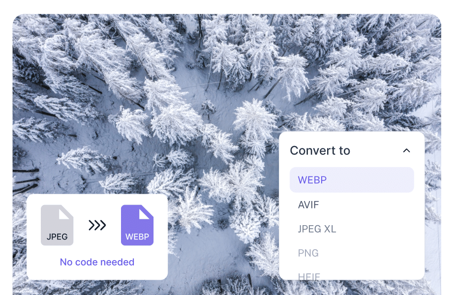
The web has moved past WebP
Modern image optimization needs more than serving lighter WebP files. Gumlet automatically detects the end-user's browser capabilities and serves the best available format: AVIF, WebP, JPEG or JPEG XL. So your images stay sharp, fast, and future-ready.
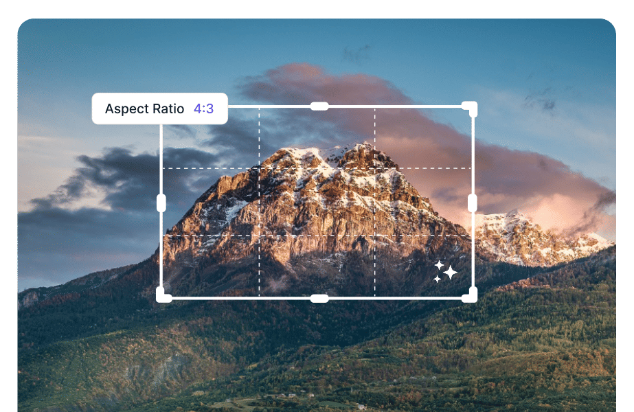
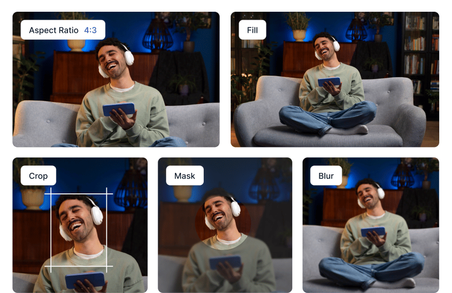
Cropping is not optimization
Resizing and cropping are basic table stakes. Gumlet goes further with smart crop, face-aware framing, background removal, upscaling, and automated transformations. Your product images, banners, and thumbnails look ready without manual edits.
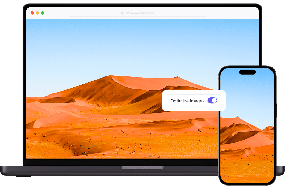
Stop handcrafting responsive images
Bunny can resize for broader desktop and mobile scenarios, but it does not offer the same granular, device-aware delivery that Gumlet does. Gumlet detects the user's exact device screen size and serves the right resolution on the fly. No manual srcsets, No oversized images on mobile.
Less image work. Faster launches.
Image optimization should not become an engineering backlog. Gumlet plugs into your site, CMS, storage, or ecommerce stack and handles compression, resizing, formats, CDN delivery, and transformations. Your team ships pages faster without babysitting images.
Gumlet vs Bunny Optimizer: Quick Comparison Guide
Features
- AVIF auto-conversion
- Yes No
- JPEG XL support
- Yes No
- AI smart crop (face/subject detection)
- Yes No
- AI background removal
- Yes No
- AI image upscaling
- Yes (JS snippet) No
- Auto responsive resize
- Yes No
- Network-aware compression
- Yes No
- GIF → animated WebP conversion
- Yes No
- Built-in lazy loading integration
- Yes No
- Magento extension
- Yes No
- AVIF auto-conversion
- No No
- JPEG XL support
- No No
- AI smart crop (face/subject detection)
- No No
- AI background removal
- No No
- AI image upscaling
- Basic desktop/mobile resize No
- Auto responsive resize
- No No
- Network-aware compression
- No No
- GIF → animated WebP conversion
- No No
- Built-in lazy loading integration
- No No
- Magento extension
- No No
The ultimate Image optimization
Retina-ready
Each image is automatically resized to appear pixel-perfect on every Apple screen with our intelligent DPR detection technology. Maintaining the ideal resolution with precision and care.
Global CDN
Deliver images to a global audience with our multi-CDN network with over 450+ worldwide PoPs. We guarantee uninterrupted image delivery with 99.95% uptime with reliable fail-safes like intelligent load balancing, region failover, and smart auto recovery.
Lazy load
Lazy load boosts website performance by loading images as they enter the viewport. This enhances viewing experiences across devices and retina displays, even on slower network connections.